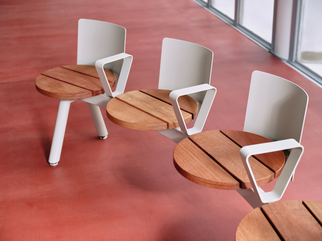
We talked to Bob Segers. One of the lead designers of a Belgian Studio Segers. This studio is run by two family generations, with a focus on product and graphic design and architecture. They design with humility to the environment and materials. They have always been fascinating by the rhythm of things like architecture, music, or nature. Thanks to this, the new Morse collection developed in cooperation with a Czech manufacturer mmcité was created.
Your studio is involved in architecture, product design, and graphics. Three distinct directions that are closely interconnected. Why precisely these three areas?
At Studio Segers we prefer to be involved in the process after the development of a product. That is the reason why graphic design made sense for us to include. Today it is not enough to only design and develop a good product to guarantee its success. We also offer art direction in general. How the product finds its way to the market and finally to the end consumer, the photography, its price-setting, and the overall marketing behind a product is crucial in the success. That’s why we also collaborate with external partners as photographers, 3D artists and marketeers to support us in this overall approach.
At the same time, working in our studio together with architects gives us a different perspective on creativity. They tend to have a holistic way of approaching projects while we, as product designers, are often focused on the details of the details. Sharing each other’s opinions is an important approach that is leading to the best connection between our products and architecture.
Your studio can truly be considered as a family company. What is the collaboration between two generations like?
At Studio Segers, collaboration, is a crucial aspect of our work. For us design is a collective practice. We are focusing on architecture led by my brother and sister-in-law, graphic design led by my wife and mother, and product design led by me, my father and Tom, who was my partner-in-crime in designing Morse collection. I would like to believe that mix of these different disciplines, generations, and the open communication we have towards each other is our strength.
In what ways is the creative process for architecture and product design the same, and what are the differences?
We already worked on a big diversity of projects. From a simple kitchen chair to extraordinary seating islands, from Villa’s to a chicken coop… It’s important that our designs and architecture are in constant harmony with its context. Keeping in mind for who we are designing it and in which context it’s going to be used. The function, the comfort, and how it should be used is ultimate in relation with the design of the products or the architecture. Only the scale is different.
Often, do you design a product for a specific house that you have built?
It happens that we design products for a specific space or project. But mostly we use architecture as an overall source of inspiration. We believe that our furniture can serve architecture. It can emphasise architecture and give it an extra touch by a distinctive colour or design. On the other hand, it can let the architecture speak for itself by having a minimal presence.
"Sophisticated simplicity." After reviewing your portfolio, we find simple and accurate forms. Has this become your identity over the past years of working in the design and architecture field?
For us, good design doesn’t have to be finger pointing. It is rather tactile, aesthetic, and understandable. At Studio Segers we try to represent a human approach to design, we belief in well-being, balance, integrity, and quality. In our opinion, interiors and objects must have a sense of calm and unpretentious look and feel. People sometimes think of architecture and design in terms of an added wow factor. However, it’s usually the simple – well proportioned – designs that are the most striking. Our design process is all about refinement, balance, and reduction. It is about distilling a design to its purist form.
For the company mmcité, you have designed a new collection of seating furniture called Morse. It is your pilot product for this Czech manufacturer. What were your first thoughts while thinking of a collection and what about the process of its design and development?
We have always been fascinated by the rhythm of things. Colonnades in modern or classic architecture, music, the long airport or railway station corridors, rhythms you’ll find in nature, a simple object in a rhythmic and out of scale quantity or just a simple graphical text in your daily newspaper.
Rhythm contributes to improving the sense of movement and flow in architecture or design. We wanted to include this flow and movement in the design of the Morse bench by creating a repetitive undefined pattern of dots and lines which are following a chosen specific path. The dots and lines refer to the name „Morse“ and are caried by a trestle-based profile. The profile consists out of straight and bended elements and gives you the freedom to create a bench of any size or shape which its surroundings need.
Morse is a collection of outdoor urban furniture; however, it can also be used indoors…
Yes, it is a multifunctional object for any space – public park, semi-public garden, railway stations or galleries. It has many options of different materials and colours to choose from. And we added next to it a series of accessories, an integrated table, a back support, armrests, usb charging options and lighting. These accessories can as well – same as the seats – be plugged on the trestle-based profile to accompany the seats. Overall, it is a modular system which easily adapt to any environment.
What colors would you dress Morse in?
In case it should match our studio’s environment we would choose a black powder coated frame with oiled thermally modified wooden seats to match our dark concrete façade.
In front of our studio, we have an all-black aluminium picnic table which is used by our team as dining table or an outdoor meeting place. Although it is clearly positioned in a non-public space, we noticed it is also used by random people passing by. They seem to enjoy our space and products a lot and we don’t mind. Usually, we wait and see until they notice they are in the garden of our studio and walk away in awkwardness.
We enjoy these little interactions of people using this seemingly „public park“ and a Morse bench would encourage this occurrence even more.
Everyone living in a city is somehow influenced by its public space. What is crucial for you in these areas?
Public space is very important as it is directly connected with everybody’s daily life. Overall, we believe that it should encourage communication, interactions between people and social life. Personally, I find very inspiring pulsing city centres where a lot is happening. Places with good pedestrian infrastructure, thanks to it I can enjoy the vibe of a place. In contrast, our studio is in a small city of Maaseik, in Belgium. It is more settled in a rural environment; we are surrounded by very calm and quiet places. And that is what I need in my daily life, to be surrounded by nature.
During Designblok, you will be presenting a new collection at the National Gallery together with the company mmcité. What kind of exhibition and accompanying program can visitors look forward to?
We only started visiting Designblok in 2020, thanks to our cooperation with another Czech brand Todus, and since than very much appreciate its approach and the atmosphere around it. It’s different from any other fair like for instance IMM Cologne or Salone del Mobile in Milano. Designblok is challenging participators to create a more artistic presentation than most are used to. We like the surprising effect it has when visiting the expo.
The presentation of the Morse bench and the overall mmcité presentation on Designblok is designed by Lexová & Smetana. An interactive presentation we are very much looking forward to seeing. 4th of October is going to be from 6pm our presentation of a Morse collection at the booth P42, everyone is very much welcomed.
Also, at the National Gallery during Designblok this year, we are launching another product line. A new outdoor sofa concept designed for Todus. I am sure we will meet over there as well.
… –.- -. … – / … – …-.


